community, soulful,
neo-traditional
Tonino is:
Tonino serves heartfelt Italian food with soul.
No pretentious culture around it, no overly complicated “foodie” dishes. Here, focus is on simple traditional plates that pack outstandingly robust flavors.
LOGO
LOGO
Tonino needed a versatile logo and brand kit. One that was flexible, yet still honored the brand ethos. Modern, yet still in touch with traditional flair. The primary logo mark instills an expectation for a culinary treat— hearty, fresh Italian food done right.
MARKETING
MARKETING
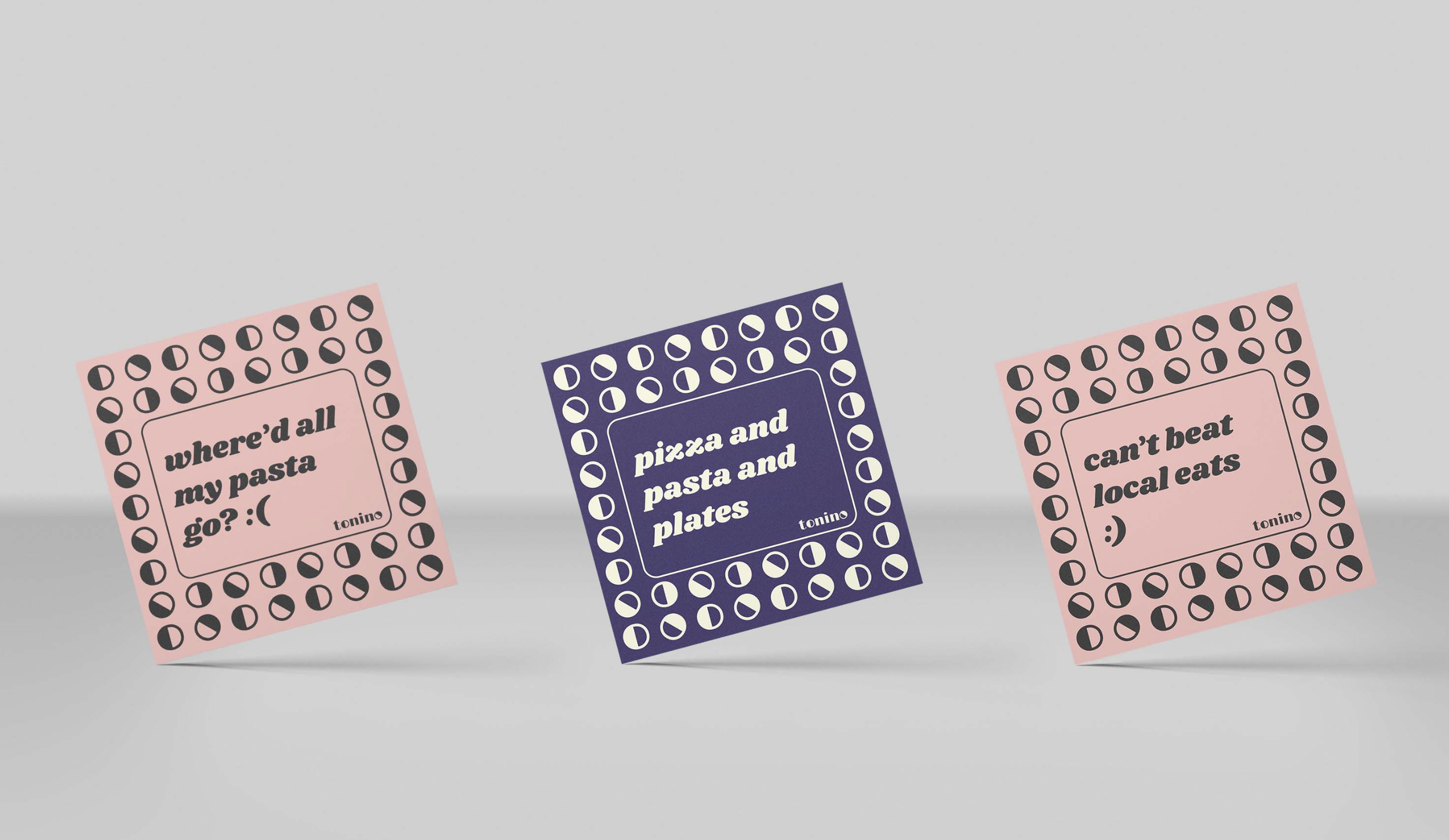
Food is fun! Especially hearty, community-centric Italian cuisine. The heart and soul of Tonino is soft and approachable, and the collateral reflects that.
Extracting the half filled circle from the main logo, it becomes a quirky and versatile design element. Creating a grid, and repeatedly inverting it births a fun and pliable pattern.


